.style-1 {
width: 150px;
height: 150px;
background-color: #04AA6D;
border-radius: 15px;
}
|
.style-2 {
width: 150px;
height: 150px;
background-color: #04AA6D;
border-radius: 25px;
}
|
.style-3 {
width: 150px;
height: 150px;
background-color: #04AA6D;
border-radius: 35px;
}
|
|
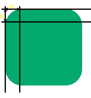
| The value entered thus corresponds to the distance over which the rounding effect is applied |
| and is applied by default to the four corners of the element. |
| |
 |
| | |
| |
How to distinguish the four angles of the form ? |
| |
| To vary the four angles, you can use the four properties corresponding to the four angles. |
| |
 |
| | | A simpler solution is to use the shortened version border-radius by specifying 2 or 4 values. |
| Entering two values distinguishes the top left / bottom right corners from the top right / bottom left corners. |
|
.style-4 {
width: 250px;
height: 250px;
background: #04AA6D;
border-radius: 0% 34% 0% 39%;
}
|
| |
 |
| | |
| Entering four values distinguishes the four angles by rotating around the shape clockwise |
| starting from the top left corner. |
.style-5 {
width: 250px;
height: 250px;
background: #04AA6D;
border-radius: 10% 20% 30% 40%;
}
|
| |
 |
| | |
| |
Distinctions of vertical and horizontal rays |
| |
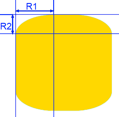
| In order to distinguish the horizontal rays from the vertical rays, it suffices to enter the two values |
| by separating them with a slash /. The value(s) entered before the slash apply to horizontal rays and |
| the value(s) entered after apply to vertical rays. |
|
| |
 |
| | |
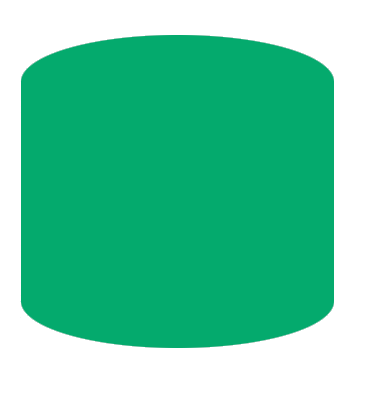
| In the following example, the horizontal rays are set to 40px for the four corners and the vertical |
| rays are set to 10px for the four corners. |
|
.style-6 {
width: 250px;
height: 250px;
background-color: #04AA6D;
border-radius: 40px / 10px;
}
|
| |
 |
| | |
| By following the same rules as we saw previously, it is thus possible to enter up to eight angle values, |
| four for the horizontal angles and four for the vertical angles: |
| border-radius: Rh1 Rh2 Rh3 Rh4 / Rv1 Rv2 Rv3 Rv4 ; |
|
| |
Examples of shapes |
| |
|
| |
Circle |
.style-7 {
width: 250px;
height: 250px;
background-color: #04AA6D;
border-radius: 50px;
/* or with percent %*/
border-radius: 50%;
}
|
.style-8 {
width: 250px;
height: 250px;
background-color: #04AA6D;
border-radius: 100% 0% 100% 100%;
}
|
.style-9 {
width: 250px;
height: 250px;
background-color: #04AA6D;
border-radius: 0% 0% 0% 100%
}
|
.style-10 {
width: 250px;
height: 250px;
background-color: #04AA6D;
border-radius: 80% 10% 80% 10%;
}
|
| |
 |
| | |
| |
You can use this little tool to generate the css code |
| |
|


 EN
EN 
 Español - ES
  Français - FR


